The U.S. is widely known to have the highest health care expenditures per capita in the world, and not just by a little, but by a lot. I’m not going to go into the reasons for this so much, other than to point out that how to rein in these costs has long been a flashpoint for debate. Indeed, most of the resistance to the Patient Protection and Affordable Care Act (PPACA), otherwise known in popular parlance as “Obamacare,” has been fueled by two things: (1) resistance to the mandate that everyone has to buy health insurance, and (2) the parts of the law designed to control the rise in health care costs. This later aspect of the PPACA has inspired cries of “Rationing!” and “Death panels!” Whenever science-based recommendations are made that suggest ways to decrease costs by reevaluating screening tests or decreasing various tests and interventions in situations where their use is not supported by scientific and clinical evidence, whether by the government or professional societies, you can count on it not being long before these cries go up, often from doctors themselves.
My perspective on this issue is that we already “ration” care. It’s just that government-controlled single payer plans and hybrid private-public universal health care plans use different criteria to ration care than our current system does. In the case of government-run health care systems, what will and will not be reimbursed is generally chosen based on evidence, politics, and cost, while in a system like the U.S. system what will and will not be reimbursed tends to be decided by insurance companies based on evidence leavened heavily with business considerations that involve appealing to the largest number of employers (who, let’s face it, are the primary customers of health insurance companies, not individuals insured by their health insurance plans). So what the debate is really about is, when boiled down to its essence, how to ration care and by how much, not whether care will be rationed. Ideally, how funding allocations are decided would be based on the best scientific evidence in a transparent fashion.
The study I’m about to discuss is anything but the best scientific evidence.
Last week, I noticed articles and posts on blogs I follow about a study released in the April 2012 issue of Health Affairs that looked at cancer outcomes in the U.S. compared to cancer care in Europe and announced American Cancer Patients Live Longer Than Those in Europe; Higher-Priced Cancer Treatments in US Offer Better Survival:
The United States spends more on cancer care than European countries, but a new study published in Health Affairs suggests that investment also generates a greater “value” for US patients, who typically live nearly two years longer than their European counterparts.
Tomas Philipson, the Daniel Levin Chair in Public Policy at the University of Chicago, and his coauthors found that the cost of cancer treatment in the United States was higher than such care in ten European countries from 1983 to 1999. However, they also found that for most cancer types investigated, US cancer patients lived longer than their European counterparts. Cancer patients diagnosed during 1995-99, on average, lived 11.1 years after diagnosis in the United States, compared to just 9.3 years from diagnosis in Europe.
As Steve Novella put it, a single study doesn’t necessarily mean anything. More importantly, this is a classic example of a study whose conclusions do not follow from the evidence and the methods. So let’s dig in, shall we? We’ll start by taking a look at the actual study itself, which, unfortunately, is behind a paywall; so I’ll try to cite as much of it as I think relevant. The article is by a group led by Tomas Philipson, the chair in public policy at the University of Chicago and is entitled An Analysis Of Whether Higher Health Care Spending In The United States Versus Europe Is ‘Worth It’ In The Case Of Cancer.
Here’s the abstract:
The United States spends more on health care than other developed countries, but some argue that US patients do not derive sufficient benefit from this extra spending. We studied whether higher US cancer care costs, compared with those of ten European countries, were “worth it” by looking at the survival differences for cancer patients in these countries compared to the relative costs of cancer care. We found that US cancer patients experienced greater survival gains than their European counterparts; even after considering higher US costs, this investment generated $598 billion of additional value for US patients who were diagnosed with cancer between 1983 and 1999. The value of that additional survival gain was highest for prostate cancer patients ($627 billion) and breast cancer patients ($173 billion). These findings do not appear to have been driven solely by earlier diagnosis. Our study suggests that the higher-cost US system of cancer care delivery may be worth it, although further research is required to determine what specific tools or treatments are driving improved cancer survival in the United States.
Before I discuss the article, I’m going to pause here for a moment to ask you, our readers, whether you can figure out just from this abstract what the fatal flaw of this paper is most likely to be. It should be mind-numbingly obvious to longtime readers who’ve read some of my previous posts on cancer screening, and, in fact, the authors try to preemptively address this criticism. They fail, but they do mention it.
Now, if I were to tell you that most of the difference in survival between U.S. and European cancer patients reported in the study was driven by breast and prostate cancer, do you know what I’m trying to hint at? Sadly, health bloggers who should know better didn’t pick up on this flaw. Not surprisingly, this study’s findings are being touted in some circles as evidence that the U.S. does better treating cancer and, by extension, that our current system is better than any sort of government-run system.
There’s just one problem with this study. That problem is embodied in three words: Lead time bias. Remember lead time bias? I’ve written about it enough times before, particularly in the context of discussing overdiagnosis and overtreatment. Basically, using the time from diagnosis to the time of death is not the correct way to analyze data like this. To explain why, a picture is worth a thousand words (not that it’ll stop me from writing a thousand words, as is my wont, because to me a picture plus a thousand words is equal to two thousand words). So here’s a picture I’ve used before to illustrate lead time bias:
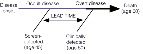
In this illustration, we see how early detection, when a cancer is in its preclinical phase (i.e., before it can be detected by symptoms or clinical examination), screening can make survival after diagnosis seem longer even if the treatments used have no effect at all. Unless the rate of progression from the point of a screen-detected abnormality to a clinically detected abnormality is known, it is thus very difficult to figure out whether a treatment of the screen-detected tumor is actually improving survival when compared to tumors detected later. If investigators are to do so, the lead time needs to be known and subtracted from the group with the test-based diagnoses. Moreover, this lead time is usually stochastic. It will be different for different patients, with some progressing rapidly and some progressing slowly. This variability, as I have discussed before, is responsible for a second type of bias, known as length bias, which is illustrated thusly:
Basically, what this graph illustrates is how screening programs preferentially pick up tumors that are growing slowly and more likely to portend a good prognosis (or represent overdiagnosis), rather than tumors that are rapidly growing and likely to portend a worse prognosis. This problem is at the heart of the issue of overdiagnosis. Basically, overdiagnosis, as I’ve discussed before, refers to disease detected by a screening test that, even if not treated, would never threaten the life or seriously threaten the quality of life of a patient. In the case of cancer, for instance, I’ve pointed out how frequently such disease is found in autopsy specimens. For instance, although the prevalence of clinically apparent prostate cancer in men aged 60 to 70 was only around 1% 20 years ago, at the time it was known that 40% of men in their 40s have histologic evidence of the disease. Thyroid cancer has a prevalence of around 0.1% of clinically apparent disease in adults aged 50 to 70, but autopsy studies looking at thyroids very finely find at least one papillary thyroid cancer in at 36% of adults. As I’ve pointed out elsewhere before as well, if breast tissue is looked at closely enough in an autopsy series of women between 40 and 50, foci of breast cancer can be found 39% of the time. In other words, aggressive screening can lead to more patients having a diagnosis of cancer for a longer period of time even without any real improvement in survival.
What all this means is that looking at population-level survival rates as a surrogate for how well a country is doing against cancer is fraught with confounders, in particular lead time bias. In a country where there is a lot of screening for cancer, lead time bias will be a bigger issue. There will also be more overdiagnosis, which will inflate the apparent survival time after a cancer diagnosis in the population. In such a case, we would anticipate that some of the largest gains in apparent survival would be in cancers for which major screening programs were undertaken, cancers like breast and prostate cancer, which is exactly what the authors observed. Now consider the time period that the authors chose to examine: 1983 to 1999. That is exactly the time period when large screening programs for breast and prostate cancer were being implemented, both in the U.S. and Europe. For example, in the U.S., breast cancer screening has traditionally been much more aggressive: Every year instead of every two to three years, as is common in many European countries and Canada, and beginning at age 40 rather than age 50, which is why these two graphs from the paper are not at all surprising. Here’s “Exhibit 1.” I have no idea why it’s called that instead of “Figure 1,” but it’s annoying and perhaps emblematic of how such a paper could have been accepted for publication in the first place. It’s as though the Philipson et al view their paper as a set of legal, rather than scientific, arguments:

Notice in the first one how the survival rate curves are almost perfectly parallel. This sort of a graph is exactly what I would expect if lead time bias were largely responsible for the difference in survival between the European Union and the U.S. Sure, that might not be the entire explanation, but seeing a graph like this sends up huge red flags, as does this figure:

This latter “exhibit” suggests that the vast majority of the detected survival advantage in the U.S. was due mainly to breast and prostate cancer, exactly the two cancers for which screening programs were ramped up beginning in the late 1970s through the 1980s.
Given the common knowledge of how lead time bias affects comparisons of the sort Philipson et al did, I really wanted to know why Philipson et al chose to look at survival statistics from time of diagnosis, rather than cancer death rates or another measurement:
The term survival gains refers to increases in years of life expectancy from cancer diagnosis seen over time. We decided to focus on examining survival gains over time because doing so provides insight into the progress that countries have made relative to their own baselines. An analysis that focuses instead on levels of survival is more likely to be influenced by intrinsic population characteristics, such as genetic predisposition to cancer, and might not reflect the impact of different health care systems.
This, of course, utterly misses the point of why looking at survival as a surrogate, at least aggregate survival rates for cancer, is generally easily confounded by lead time bias and other factors, in particular overdiagnosis. That’s why mortality rates are a better measure for how well we are doing against cancer. They aren’t affected by lead time bias, overdiagnosis, or length bias. One of the best explanations of why mortality rates are a better measure on a population level for how we are doing against cancer than survival rates was provided by Aaron Carroll:
Let’s say there’s a new cancer of the thumb killing people. From the time the first cancer cell appears, you have nine years to live, with chemo. From the time you can feel a lump, you have four years to live, with chemo. Let’s say we have no way to detect the disease until you feel a lump. The five year survival rate for this cancer is about 0, because within five years of detection, everyone dies, even on therapy.
Now I invent a new scanner that can detect thumb cancer when only one cell is there. Because it’s the United States, we invest heavily in those scanners. Early detection is everything, right? We have protests and lawsuits and now everyone is getting scanned like crazy. Not only that, but people are getting chemo earlier and earlier for the cancer. Sure, the side effects are terrible, but we want to live.
We made no improvements to the treatment. Everyone is still dying four years after they feel the lump. But since we are making the diagnosis five years earlier, our five year survival rate is now approaching 100%! Everyone is living nine years with the disease. Meanwhile, in England, they say that the scanner doesn’t extend life and won’t pay for it. Rationing! That’s why their five year survival rate is still 0%.
None of this is to say that screening for cancer is useless. I’ve never said that, nor do I believe it. I have, however, explained that demonstrating real increases in survival due to screening is devilishly difficult, far more difficult than “common sense” would lead the average person (or even physician) unschooled in the intricacies involved would think, hence the controversy over prostate and breast cancer screening and, in particular the UPSTF recommendations from two and a half years ago regarding screening mammography.
Aaron Carroll also did me a favor and saved me a lot of work by compiling mortality rates for various cancers in G8 countries as another way to illustrate what is almost certainly closer to the real situation. The fact that he did it for years much more recent than the time period Philipson et al. did was rather curious, of course, but maybe not so much so given that more recent statistics show that most European countries have results much closer to those in the U.S. than 20 years ago. Be that as it may, Carroll points out that the U.S. is among the best in the world when it comes to breast cancer but not actually the best. Japan appears to be doing much better than the U.S. As a cancer surgeon, I will point out that breast cancer in Japan might be different, possibly due to lifestyle differences. In terms of other cancers, Carroll concludes that for cervical cancer, we’re in the middle of the pack; for colorectal cancer, we’re unequivocally doing the best; and for prostate cancer we’re in the high end of the middle of the pack. The most interesting observation is that for lung cancer we are doing abysmally. The obvious excuse for that is tobacco smoking, but it turns out that the U.S. has one of the lowest rates of tobacco use of these countries; so that doesn’t explain it. As Aaron’s last cancer graph shows graph when it comes to overall mortality from cancer, compared to the G8 countries, the U.S. is doing well but is not the best. As Aaron sums it up:
Not nearly where you’d like to see us. Because we don’t do as well with some of the more prevalent cancers, we wind up doing much worse overall when it comes to cancer mortality than you’d think. This is why, when some point to us having the “best” health care system, they focus on colon cancer or breast cancer, not on lung cancer. Overall, though, we’re not.
I can’t help but notice, too, that if you really want to compare countries with universal health care systems to the U.S. (and, let’s face it, that’s what this is really all about, trying to show that “socialized medicine” leads to “death panels,” health care rationing, and lower survival rates for deadly diseases like cancer), you really should include Japan in the mix. The problem, of course, is that Japan does a lot better than the U.S. in many areas. My point, however, is not to denigrate the U.S. healthcare system. It does quite well in some areas, not so well in others, and overall it’s very good but not spectacular, at least when we look at cancer mortality. The real problem is not that the U.S. system doesn’t deliver quality cancer care. Rather, the problem is that delivering that care in the U.S. is spectacularly expensive for the results it gets compared to other countries that spend considerably less.
Surprisingly (to me at least), there’s been some really good reporting that punctures the claims of this particular study. First, there’s this one, in which Steven Reinberg interviews Dr. Otis Brawley, the chief medical officer and executive vice president at the American Cancer Society. Dr. Brawley points out that, yes, overdiagnosis is likely the fatal confounder not accounted for by Philipson et al.
More impressive is Reuters article by Sharon Begley, in which she explains very well why this study doesn’t show what Philipson et al conclude that it shows. Also, unlike the case in some other posts and articles that I’ve seen dealing with this study, Begley doesn’t suggest that Philipson et al completely ignored lead time bias. In all fairness, before finishing, I have to state unequivocally they didn’t. The problem with their analysis is that they made a highly unconvincing argument using mortality statistics for why they don’t think lead time bias was a major confounder of their results. In fact, they did some rather amazing contortions to try to justify their approach of focusing on survival statistics instead of mortality rates, even to the point that they included an online supplement in which they examined mortality rates in the various countries included in their study. Here’s the problem with that argument, which is summed up very well in Begley’s article:
The Philipson team acknowledges that survival data can be misleading. They justify their approach, however, by saying that because deaths from cancer as a percentage of a country’s population fell faster in the United States than in 10 countries in Europe from 1982 to 2005, the higher U.S. survival “suggests that lead-time bias did not confound our results.”
Some experts in cancer statistics were not convinced.
“Why do the authors use the wrong metric – survival – in the analysis and then argue that the right measure – mortality – provides corroborating evidence?” asked Welch. “As long as your calculation is based on survival gains, it is fundamentally misleading.”
Indeed. I found that very curious myself, particularly how the justification was buried in an online supplement, rather than described in the text of the paper itself. It makes me wonder if it was something the authors cooked up to justify themselves after peer reviewers started hammering them on the issue of lead time bias. It wouldn’t surprise me in the least if that were the case, although, again in all fairness, it might not be. Similarly, their lame argument that they chose increases in survival as their metric because it would allow them to compare each country to its baseline made me laugh. Do they seriously believe that following mortality trends over time wouldn’t allow them to compare each country to its baseline? Is it just me? Am I alone in finding such an argument … unconvincing?
In reality, there are two ways to study how well different countries are doing in terms of cancer care. One way is, as mentioned several times in this post, to focus on cancer mortality. Another way is much more difficult in that it involves comparing stage-specific survival rates, and, for cancers for which there are screening programs, survival rates for screen-detected cancers and survival rates for all cancers. The latter is an analysis that is very difficult to carry out, given that not all countries have good registries that have cases properly stratified by stage and that it wouldn’t be able to compare how countries are doing against all cancers overall, only individual cancers. Also, stage definitions change over time, and carrying out such an analysis would involve taking such changes into account—not an easy adjustment. Yet, Philipson et al. chose to do neither of these things; indeed, they picked the very metric for which confounding factors, such as lead time bias and overdiagnosis, tend to be the most problematic.
I wonder why.
More importantly, I wonder how this study ever passed peer review. One would think that Health Affairs would have at its disposal a cancer epidemiologist who understands overdiagnosis, lead time bias, and length bias to tap as a peer reviewer. I guess not.